Hey! This post's a little over two years old now, so some of what's here might be out of date. Still worth a read, but if anything really matters to you, it's worth double-checking against a newer source too.
So far we've been using a fairly standard React Storybook environment.
And whilst we can achieve all of the basic pattern library functionality we need in this series with the standard setup, we can take it a step further with Storybook add-ons.
Add-ons can be thought of as plugins, they build upon the existing functionality and add on features which developers require in their documentation.
It gives those previewing components in our Storybook environment control over data that we use as props in our React components. Allowing any stakeholders of the project to quickly experiment, learn and interact with the developed components.
With the package installed, we now need to add some configuration to tell Storybook to make use of the add-on. We do this by creating a file in our root directory called
addons.js
- __Storybook__
- __.storybook__
- addons.js // ? Let's add some addons
- config.js
- webpack.config.js
- __components__
- __Storybook__
- __.storybook__
- addons.js
- config.js
- main.js
- presets.js
- preview.js
- webpack.config.js
- __components__
In our `addons.js'file we will then need to import the knobs add-on and register it with the following code. Keeping any default configuration that may have shipped with your storybook initialisation.
Now our Storybook environment has the add-on registered, we can start including it in our stories.
We will need to restart Storybook if you currently have the local development server running on your machine. Go ahead and kill the process and start again to make use of the new configurations.
We've imported a text knob from our Storybook knobs add-on which will give us a function to create a controlled input in our Storybook interface.
This function accepts three parameters -
Label (Input label for the Storybook knob)
Default Value (Initial value for knob e.g. Basic button)
Group ID (Used to group multiple knobs)
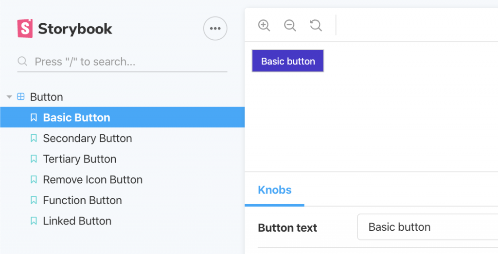
When we view our Button React component in Storybook, you'll notice that we have a new panel interface available to us to interact with. Currently, this only includes one knob (the text knob) but we will be adding more soon.
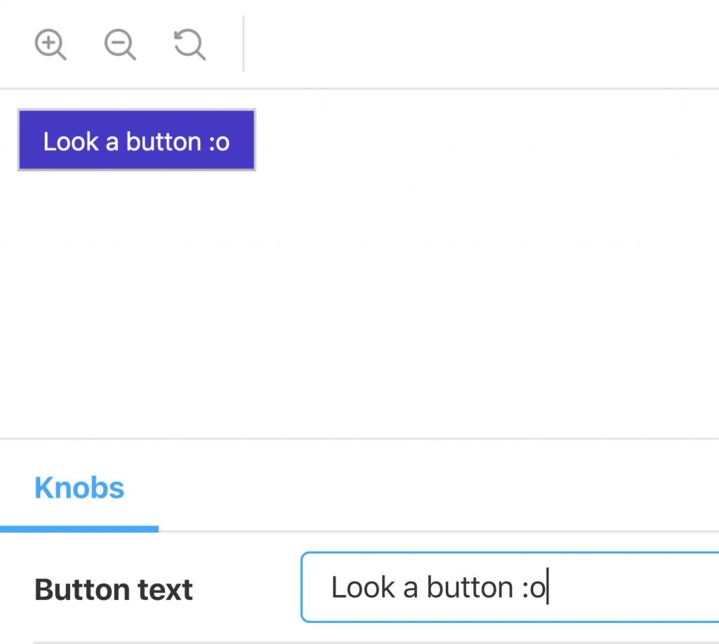
The text knob provides an HTML input field of type text which allows us to preview how the React button component reacts to the string of text we provide it in real-time.
This is great because it gives immediate feedback to anyone exploring your documentation without the need to create a React environment. You can read more about knobs and why I love them at - https://whatjackhasmade.co.uk/component-driven-development
Before we set about adding more controls to our Button component story, let's first tidy up how we structure our knobs and the data we apply to our stories.
I like to separate my knob data out into its own separate `.json'file as our stories could include a large amount of knob data that would detract focus on the components themselves.
I store the knobs data in a file called
button.knobs.json
- __Storybook__
- __components__
- __atoms__
- __button__
- button.jsx
- button.knobs.json
- button.stories.js
- button.styles.jsx
Our JSON file will contain an object with the key `innerText'which will hold keys aligned with the function arguments that the text knob expects.
{
"innerText": {
"label": "Button text",
"default": "Button text",
"group": "text"
},
"icon": {
"label": "icon",
"options": {
"bag": "bag",
"cart": "cart",
"plus": "plus",
"user": "user",
"x": "x"
},
"default": "bag",
"group": "images"
}
}
We can then import the JSON object to our story file and destructure the
innerText'key value to be used in our
text'knob arguments. I've also added a select input which will control the icon we want our Button component to return, I cover the use of this function in the video accompanied with this lesson.
import React from 'react';
import { withKnobs, select, text } from '@storybook/addon-knobs';
If you've followed along step by step until this point, you should have a list of PropTypes that define what props the React component Button accepts.
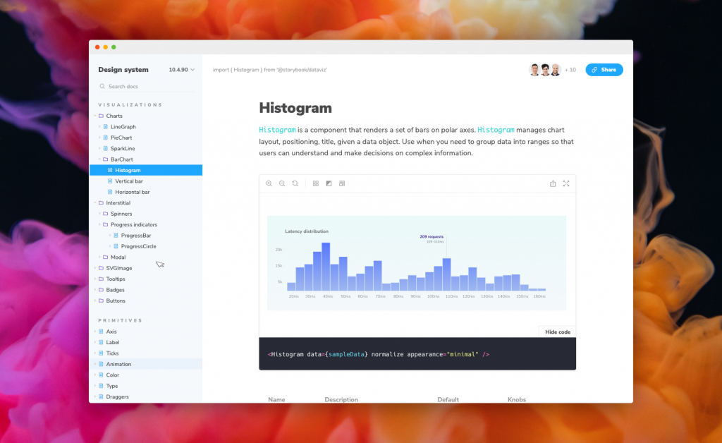
The Docs add-on is quite smart in that it will scan your component for this configuration, and if found will output a table for us within our story that details what data the component will accept.
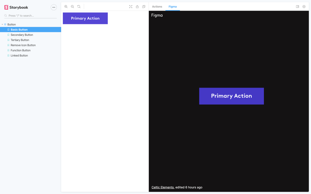
Throughout this course, we will be referencing the Figma interface designs that we want to be implemented as front-end components.
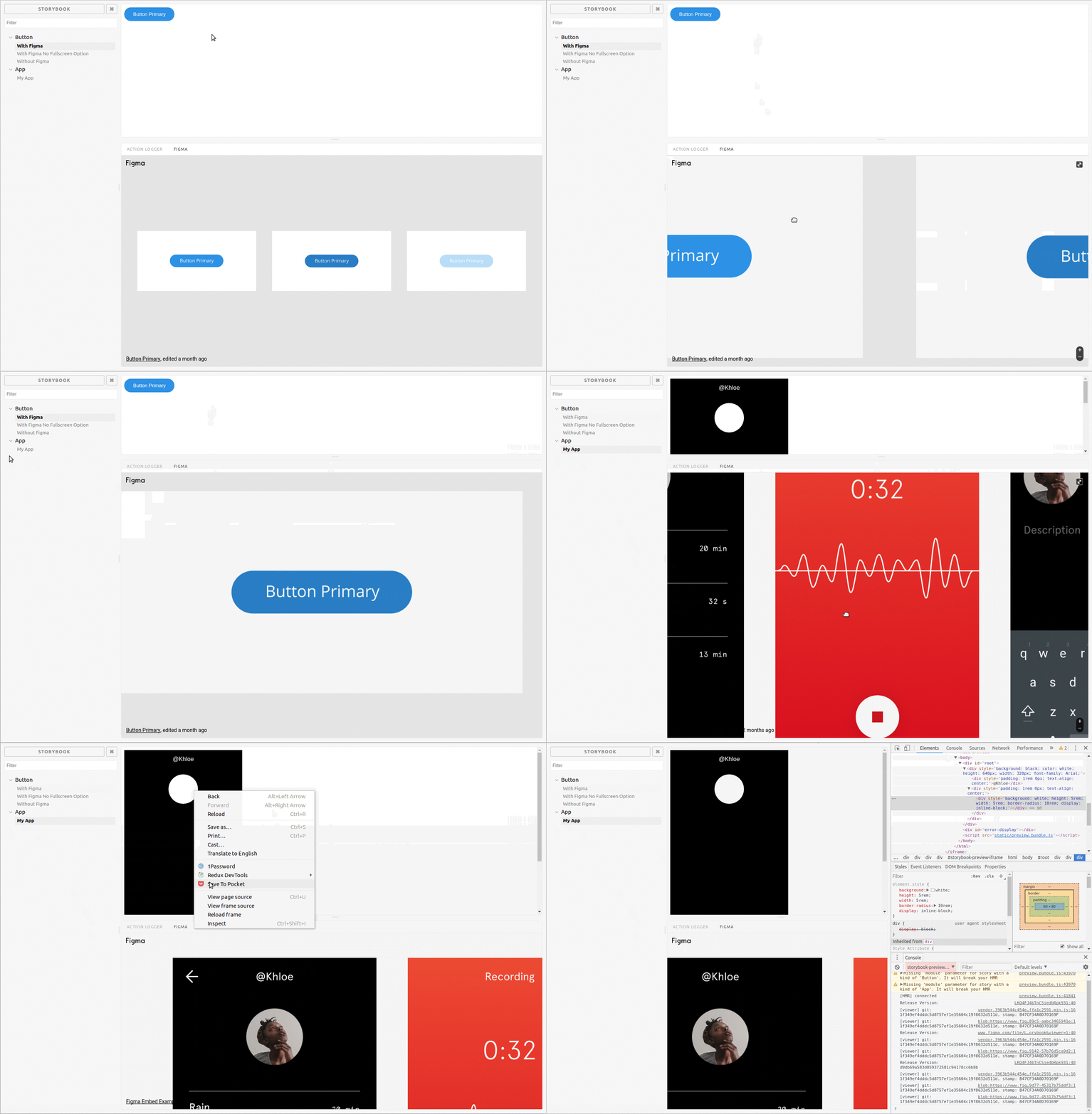
As the components use the designs, it makes sense to include them in our Storybook environment as a point of reference during development, allowing us to create consistent components in line with the designs provided.
Not only do they serve the front-end development teams but the Design Storybook Add-on is also great for sharing when you want to have components signed off by QA teams.
We can go ahead and install the add-on using the following package.
Our final Storybook setup encapsulates a great blend between dynamic interactions and comparative assets which we can use to create exciting, accurate front-end implementations of our website.