Component Driven Development (CDD) in React
Hey! Just so you know, this article is over 2 years old. Some of the information in it might be outdated, so take it with a grain of salt. I'm not saying it's not worth a read, but don't take everything in it as gospel. If you're curious about something, it never hurts to double-check with a more up-to-date source!
Component Driven Development (CDD) is a popular methodology used in approaching modern website development. If you code using atomic design principles or utilise the benefits of a JavaScript framework, you may already be adhering to some of the principles the method adopts.
At its core, Component Driven Development (CDD) is an all-encompassing concept which applies globally to design systems, pattern libraries and modern JavaScript frameworks, most notably React.
Approaching problems with a Component Driven Development (CDD) first approach has many benefits (Osmani 2017), such as -
- Faster development
- Simpler maintenance
- Better reusability
- Lower barrier to entry of understanding
- Better modelling of the overall system
In this article, I aim to demystify the term Component Driven Development in plain English and how it applies directly to React.

What is Component Driven Development?
#In the early days of my website design and development career, the biggest lesson I learnt from my work peers was that a website is often an interface made up of repeating components and patterns.
Repetition in component designs will help designers maintain rules that apply to an interface, such as font-sizes, colour palettes, and spacing rules.
Repetition in component developments helps developers to maintain and scale their code.
Having a 'button'component, for example, will help as any changes made to the button will have a ripple effect to all instances of the button component throughout a site.
In it's simplest form this could be a CSS change to the font-size of a button CSS selector which influences all buttons used in a site.
Repetition creates familiarity which makes a user feel at ease and helps them to create informed decisions.
What I'm trying to illustrate here is that repetition and reusability will benefit all stakeholders of a system. Providing global rules to systems which enable better use of an interface and improve the design and development processes.
Component Driven Design is a continuation of this idea, but with more precision.
“Simply put, component-driven development means designing your software applications by building loosely-coupled independent components.” (Saring 2019)
Instead of looking at all of the components as a whole, Component Driven Development is an approach to software development that focuses on precision, attention-to-detail, and modularity for an individual component at one time.
Modularity, for us, most importantly allows for reusability.
So we know a bit more about CDD, but can we now define a component?
What is a Component?
#A component is a well-defined, and independent piece of our app's user interface. A component could include, but is not limited to a -
- Button
- Heading
- Call to action
- Hero banner
- Table
- Navigation
- Header
- Footer
- Collection of Post
- Filter Control
- Pagination
In the context of website development, reusable components and designs are nothing new. At its core, you would have most of these components available as HTML5 elements.
You would then style these components globally with a base CSS file that targets say all instances of the HTML button element.
If you needed to extend the CSS of a specific instance of a button to include a new background colour or to adhere to a certain theme you would then introduce a class to your CSS file and apply it to your HTML button element.
The use of class names, BEM, and CSS utility libraries have been around for a decade, with libraries like Bootstrap being introduced in 2010 (I can't believe that's almost a decade away).
These pre-existing concepts often worked by modifying classes on an HTML element to bring in styles associated with how you want the element to render on the front-end of your application.
For example -
These concepts are still relevant in the modern age of website development. When I build a React component, even with a CSS-in-JS library, I will use BEM class names for my component and the elements contained in my component.
In modern JavaScript frameworks like React, we can now style components based on prop attributes that we feed our React components. Instead of the examples above you'd use something similar to the syntax that follows -
The concepts are exactly the same, the difference is the technologies used to generate the CSS and apply the rules to your components.
The reason I am going over these methods is to illustrate that although component focused applications are the new hype, with design systems and pattern libraries popping up in 20% of Website conversations, the technology has always been there and has always been used.
Again the only thing that has changed is the technology, not the concept.
Component Driven Design?
#Creating reusable components isn't confined to development. Interface design at its roots has a focus on creating familiar patterns and pages which empower the user to make use of a software product.
Creating modular patterns such as buttons, text styles and form structures helps to create a brand identity which informs the user they are still within the correct application.
The patterns used to give the users power in knowing where to click, how to process information and make use of the tools you provide them.

Intersections with Atomic Design
#Atomic design is a term pioneered by Brad Frost.
His approach to modern website design has truly changed the way I look at every interface I come into contact with.
The concept of Atomic Design focuses on looking at interfaces as a whole and then dissecting them into components of various size to make up the interface.
This may sound familiar to CDD, however, the primary difference is that Atomic Design introduces a standardised language for discussing components and labelling structures. You have five choices of labels in Atomic Design -
- Atoms
- Molecules
- Organisms
- Templates
- Pages
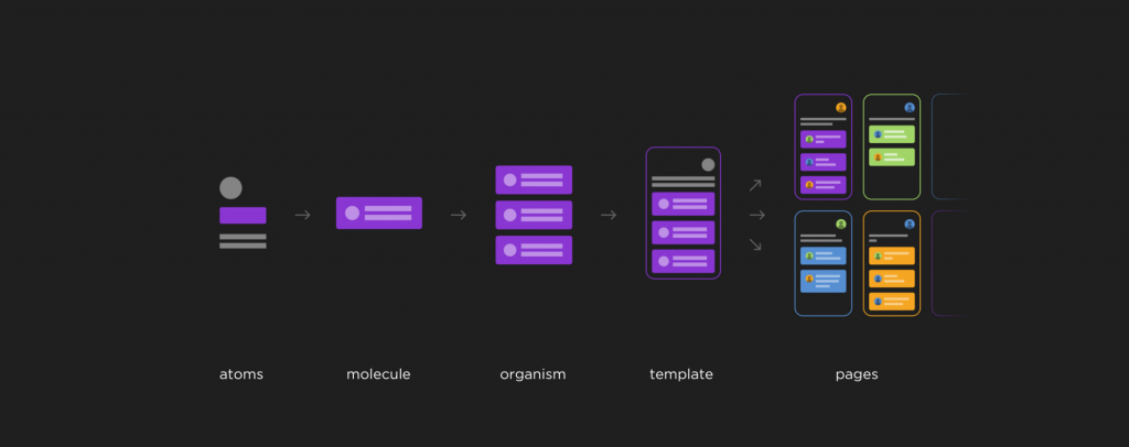
Image source - blog.prototypr.io
Component Driven Development and Atomic Design can be thought of as neighbouring concepts, however, they both hold their own unique attributes.
Component Driven Development (CDD) can be used without Atomic Design and vice versa. However, when you combine both concepts you can create a workflow for your website design and development process which takes benefit of both methodologies.
In applying Atomic Design naming rules and concepts to your web application, you adhere to a universal language shared with passionate developers and designers who have come into contact with Brad's Atomic Design methodology.
In applying Component Driven Development you harness a precision, a focus on the performance of each component in your application, allowing you to assign responsibility to team members over functionality, layout and presentation in the final delivery of components.
Component Driven Development in React
#In the context of React, a Component Driven Development approach is welcoming. React supports and focuses on dissecting splitting your interface into small repeatable patterns and developing patterns which create a page layout.
However, if you can separate the idea of a page layout completely from the initial development stages, you can create a focused mindset when approaching each individual building block of your application.
As taboo as it is to say in my industry, with the patterns built you have “lego blocks” which you can now use to build the pages designed.
Approaching an application solution with a CDD first approach has advantages as patterns can, in theory, be reordered and used to create dynamic layouts.
Swapping out content with the use of 'props'in React, you can focus on creating layouts and then importing content from any source (APIs, internal databases, etc.) to render out the pages.
I often develop components with placeholder text in a pattern library before importing the components to a live environment where I will pull data from a content management system (CMS) like WordPress.
To keep your components organised, you can lean on the tools created by experts.
My tool of choice in React is Storybook.
Storybook
#
Source - medium.com
Storybook and React
#Storybook is a popular tool that can be used with React, Vue, or any vanilla code setups you may have.
In the context of React, Storybook allows you to create React components as you normally would in an application. Then within your Storybook, you can create 'stories' with the use of the Storybook file extension `.stories.js`.
Within a storybook file, you will commonly import a React component that you want to document and then use Storybook functions, and if you're feeling fancy, a few Storybook plugins from the Storybook ecosystem to attach information regarding how to use the component in a React application.
Your storybook environment can exist as it's own separate git repository or can live within an existing React project's repository.
For reusability, I often separate my pattern library from any applications which make use of the components.
This is to reduce the ties between a set of components and an application, allowing the components to become reusable amongst many branded systems.
Storybook Addons
#Aside from the foundational structure of a boilerplate design system or pattern library, Storybook has a list of 'add-ons'that can be used to extend the core functionality Storybook provides.
One of my favourite 'addons'is the Storybook Knobs.
Storybook Knobs Addon
#Knobs give the viewer of the design system control of the reusable components by providing a form interface to modify props fed into components.
I've whipped up my own example of a button component that accepts two unique knob controlled props, text and colour.
View the Storybook system at - https://knobs.netlify.com/
Source Code: https://github.com/whatjackhasmade/Storybook-Example
If you go ahead and view the example, you'll be presented with two controls directly underneath the button component example which will allow you to interact and learn how the component is dynamic and changes based on the data you give it.
This is not only a magical and unforgettable experience, but it's also a huge boost in communicating component development to all stakeholders of a project.
Clients, managers, designers, developers and even the office cleaner can now quickly access components, test them and learn about them without needing to know how to code or design.
Well Known Brands Storybook Examples
#To get a good idea of what a Storybook interface may look like, and the code structure and practices it includes, I've listed three popular design systems from -
- GOV.UK
- Buffer
- Wix
To view a full list of officially endorsed Storybook examples, check out the official Storybook website at - https://storybook.js.org/docs/examples/
GOV.UK
#Example: https://govuk-react.github.io/govuk-react
Source: https://github.com/govuk-react/govuk-react
Buffer
#Example: https://bufferapp.github.io/buffer-components
Source: https://github.com/bufferapp/buffer-components
Wix Storybook
#Example: https://wix-style-react.now.sh
Source: https://www.wix-style-react.com/storybook/?path=%2Fstory%2Fcomponents-typography--heading
Conclusion
#I didn't really know what this post was going to be when I first set out.
To be completely honest, I'm not sure what it is now!
We've covered a lot of ground here, Component Driven Development, core design concepts, scalability, utility class libraries, atomic design, react components, pattern library tools (like storybook), and then finally some examples and demos of what this might look like in practice.
Hopefully, you've taken away something from this post, whether it's an approach to website design and development through component precision.
Maybe you've learnt about Storybook and want to spin up your own instance to store your React components in?
If you do dive into Component Driven Design and want to shoot the sugar on the topic, feel free to reach out to me on Twitter anytime @whatjackhasmade
Happy coding!
Further Learning
#OSMANI, A., 2017. Learning JavaScript Design Patterns
SARING, J., 2019a. Building A UI Component Design System [viewed 1 November 2019]. Available from: https://blog.bitsrc.io/building-a-consistent-ui-design-system-4481fb37470f
SARING, J., 2019b. A Guide To Component Driven Development (CDD) [viewed 1 November 2019]. Available from: https://itnext.io/a-guide-to-component-driven-development-cdd-1516f65d8b55
STORYBOOK, 2019. Introduction To Design Systems [viewed 2 November 2019]. Available from: https://www.learnstorybook.com/design-systems-for-developers/react/en/introduction/