Workout Application - Routine Session
Hey! Just so you know, this article is over 2 years old. Some of the information in it might be outdated, so take it with a grain of salt. I'm not saying it's not worth a read, but don't take everything in it as gospel. If you're curious about something, it never hurts to double-check with a more up-to-date source!
Introduction - Routine Session
#'Routine Session' is the product of my beginner phase of attending the gym. I found myself running into common issues with several mobile applications, as they have not met my needs. Instead of whining about the problem in some forum, I decided to fire up Adobe Photoshop and create my workout application.
The Challenge
#The challenge was to create a mobile application both for smartphones and smart watches. This application would allow you to specify a set amount of repetitions. Between sets, you would have a cooldown period to allow your body to rest before moving on to the next set. Each set would have its workout specified or repeated (Bicep Curls once, or Bicep Curls repeated four times in succession).
The Solution
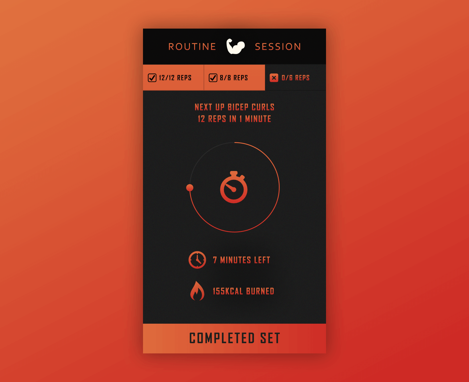
#The Routine Session application would need to display to the user -
- What workout their set included
- How many sets had been complete
- How many sets were left
- How long was left for a cooldown period
- What set they are currently on
- How many minutes of the entire workout session is left
- How many calories burned
- A completed set button to indicate time for a cooldown period
Devices
#Smartwatch
#The smartwatch had the least screen space available for the two devices. It was important to organise the information into four groups with a centre focused button and action button beneath.
Smartphone
#The same components would move from smartwatch screens to smartphones. However, as there was more screen space available, the smartphone included more padding and whitespace for the elements to breathe.
Reflection
#Although there is less screen space available on smartwatches, I feel as if there could have been more feedback included for the user. The removal of the cooldown period label in favour for more whitespace hinders the user as they are left to judge the slider based on its relative position to work out how long was left.
Designs
# Full project can be found at my Behance Page - https://goo.gl/m0A5Fg