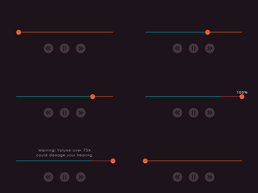
Volume Control Interface
Hey! Just so you know, this article is over 2 years old. Some of the information in it might be outdated, so take it with a grain of salt. I'm not saying it's not worth a read, but don't take everything in it as gospel. If you're curious about something, it never hurts to double-check with a more up-to-date source!
 The volume control interface design focuses on displaying the volume amount with visibility. If the application were to be used on a computer or mobile device then the user's input (finger, mouse, click) would not obscure the volume amount being displayed. I have also added a warning message that will display when a user decides to play music anywhere above 75%. Everything in the UI was made in Photoshop. Font - Champagne and Limousines