Simple, Fresh Signup Form
Hey! Just so you know, this article is over 2 years old. Some of the information in it might be outdated, so take it with a grain of salt. I'm not saying it's not worth a read, but don't take everything in it as gospel. If you're curious about something, it never hurts to double-check with a more up-to-date source!
The design scenario
#Create a sign-up form using basic information like name, address, email, date of birth, and so on.
Try to include a variety of elements - checkboxes, drop-down menus and input fields, etc. - and design a clean set of icons that you can use to represent each section. A sign-up form is an important point of engagement between user and site, so the way they look and function is really important.
We've pulled out some inspiration images here for you to use as a guide, but we advise spending some time researching online yourself. Check out Collect UI: it's full of awesome UI elements like input forms, buttons and onboarding processes.
The Solution
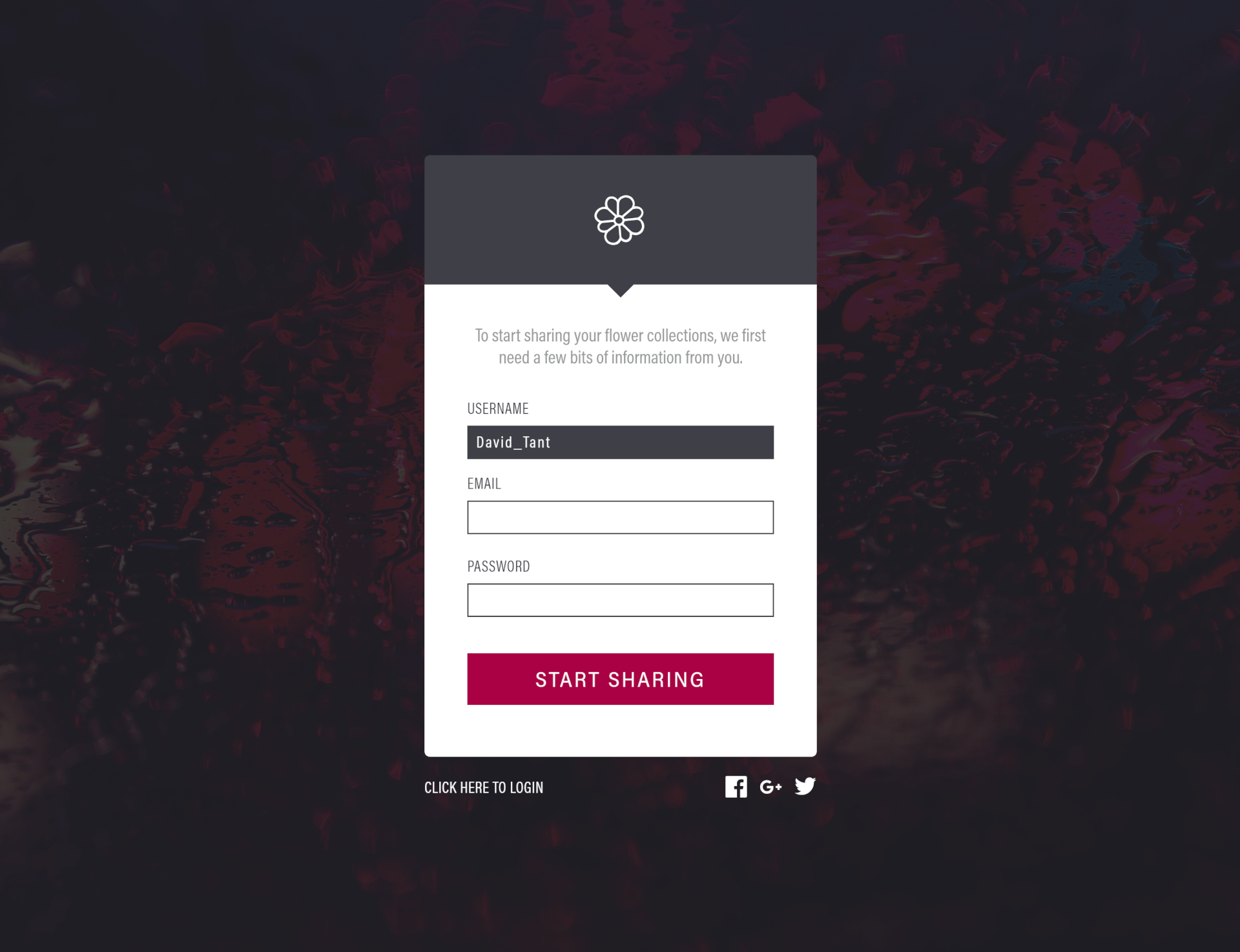
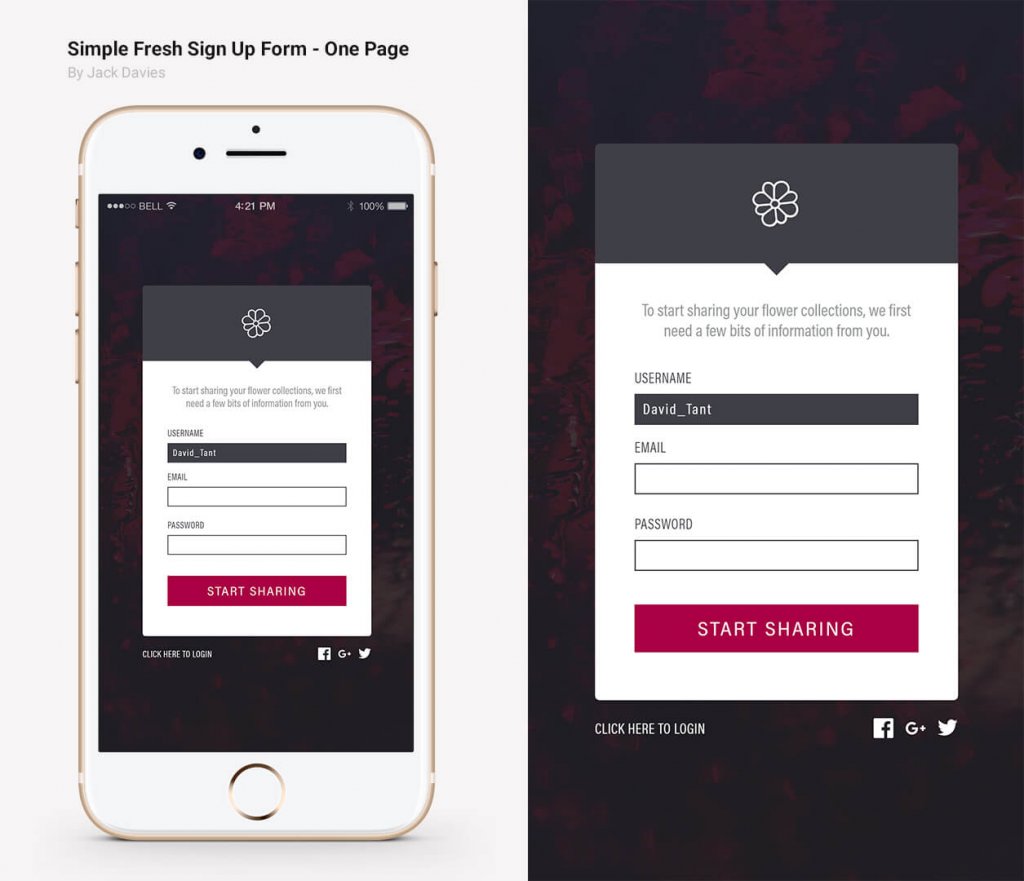
#The end product is a mobile design with a simple 3 step signup process. This includes a Username, Email and Password field. Once a field is filled with a valid input, it the becomes filled in with a solid grey and the text converts to a white colour. This feedback indicates to the user that they can move on to the next field. If the user already has an account, options are given at the bottom to login via another link or using a linked social media account.
Designs and Mockups
#
