Rebuild Part 6: Mobile First
Hey! Just so you know, this article is over 2 years old. Some of the information in it might be outdated, so take it with a grain of salt. I'm not saying it's not worth a read, but don't take everything in it as gospel. If you're curious about something, it never hurts to double-check with a more up-to-date source!
With an average time spent of over 2 hours a day on smartphones in the UK (Chaffey, 2017), it is a no-brainer to design a website mobile first. Not only are you developing a website that is tailored to be used by those on mobile devices, but you are also keeping a centred focus on how a website should perform with alternating network speeds (2G, 3G, 4G, Wi-Fi). 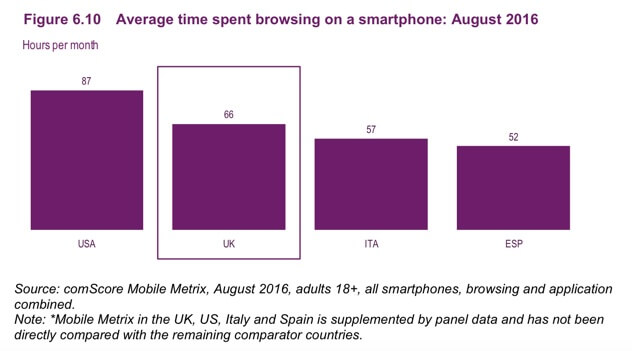 (Average Time Spent Browsing a Smartphone - August 2016, 2017) In this post, I will show you how I rebuilt my homepage to become mobile first both in the number of requests required and overall file size.
Current Mobile Design and Requests
#Homepage
#Design
#The current design of my homepage is broken down into sections.
- Latest Post
- About Me
- Following Posts
Now although there is nothing wrong with this layout, as the About Me section is only shown on the homepage. It is still jarring, and the about section should be kept to a separate page. I now have another website which describes who I am, what qualifications I've accomplished and what projects I've been working on over at webjack.co.uk. As well as this, the images although shown on a desktop in excellent quality with no overlay. On mobile, I have had to include an overlay to keep the contrast of text over the image consistent and readable. The pictures may not seem like a large issue as the pictures are of small size, but for every picture, there is a separate image request made to the server.
Requests
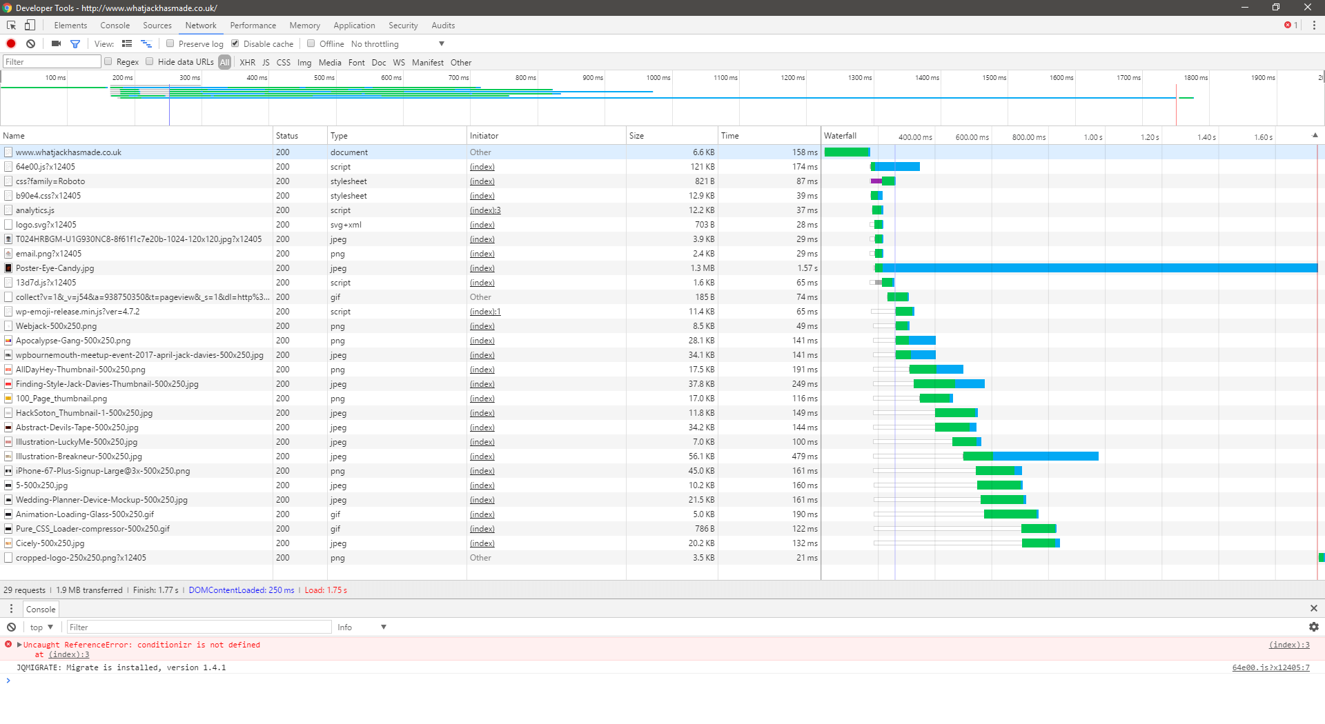
#The current number of requests made to the server on a mobile device (without network emulation) are 29 requests. The requests total a file size of 1.9MB in total every time someone navigates to my homepage on a mobile device. The largest image served by the website is the latest post image which seems to be responding with the full resolution of the thumbnail for that post.
Single Post Page
#Design
#The design for my single post pages are relatively straightforward; it includes the header and footer found on any other page and includes a wrapper between them that includes the content produced in the backend of the admin dashboard.
Requests
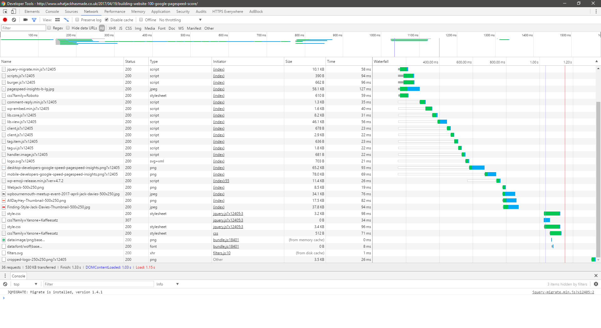
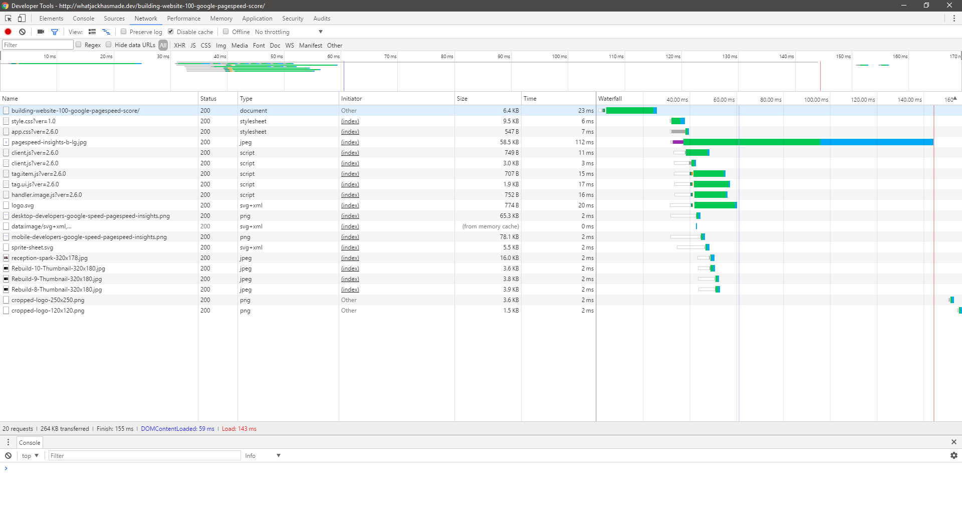
#The current number of requests made to the server on a mobile device (without network emulation) are 36 requests. The requests total a file size of 530KB in total every time someone navigates to the post on building a website that scores 100/100 in the Google page speed score.
Mobile Rebuild Design and Requests
#Homepage
#Design
#With the new redesign, I have abolished the current format altogether. The homepage only displays my latest content in chronological order with no focus on the most recent post. If users wish to find out more about me, I have included a link to an about page in the footer of my website as this is secondary content. Although it is enjoyable to learn about the person behind the content, the content should still take the primary focus on my user's attention. As well as this, I have done some research into the best way I can minimise the number of requests made to my website. Clearly, the primary source of requests comes from the thumbnail images that occur for every post. To avoid loading each thumbnail I have instead by default loaded a repeating SVG pattern through CSS. These patterns can be sourced from https://www.heropatterns.com/. After searching through the patterns and finding patterns which included a small amount of code, I then added new classes to my CSS for the patterns to be applied. Now that I had the five pattern classes available, I now had to figure out a logical way of applying these to the items. To do so I just simply added a variable counter that goes from 1 up to 5 and repeats. I append this variable in the class name of the items.
Now we have no thumbnail requests, and each post stands out from the previous until the loop hits a count of 5. Although this is a great solution, the SVG patterns currently being used could be minimised further and somewhat stick out like a sore thumb. I will return at the end of the performance development for a design rethink and perhaps modify the existing patterns used.
Requests
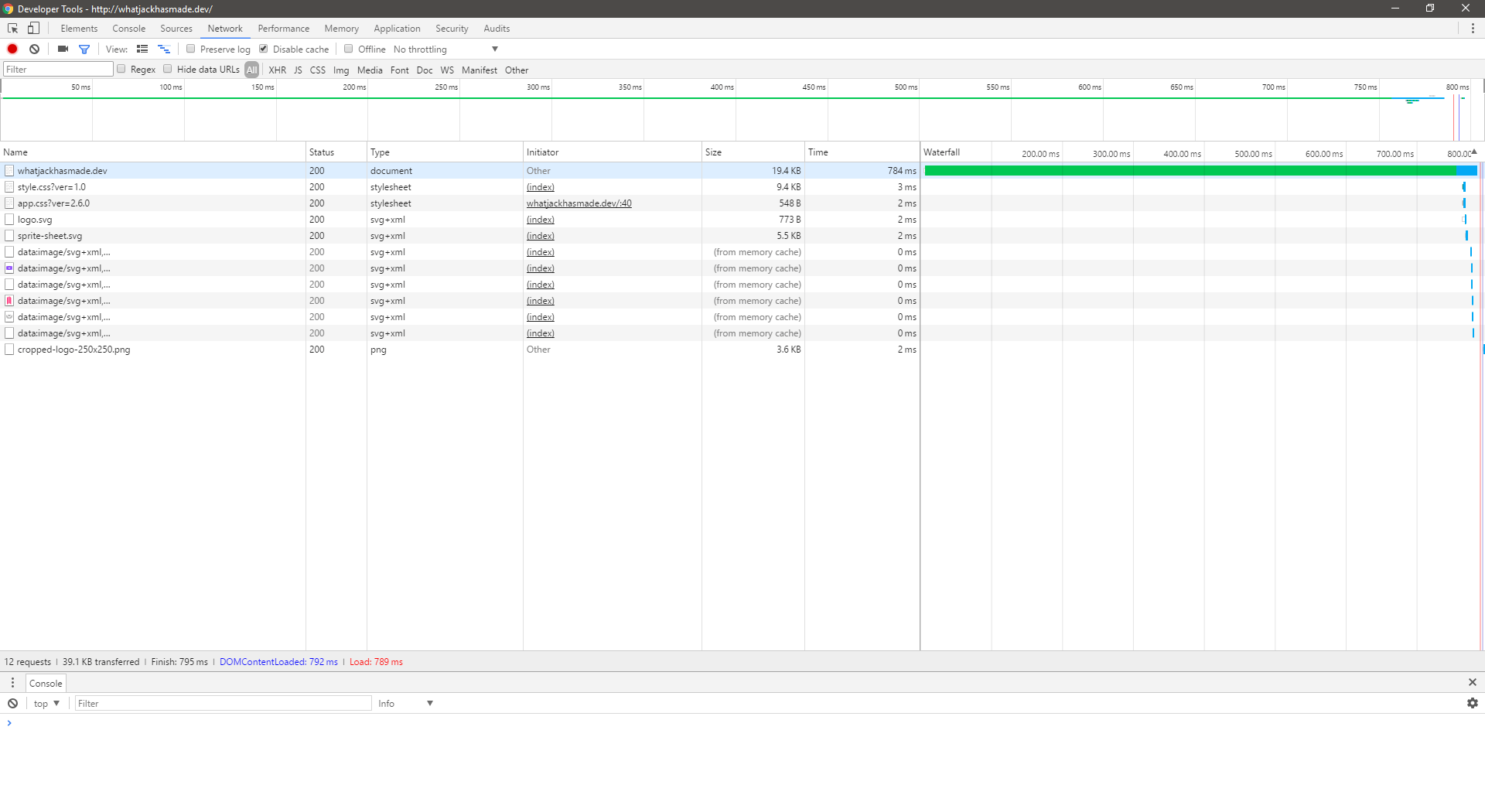
#The current number of requests made to the server on a mobile device (without network emulation) now are 12 requests. The requests total a file size of 39.1KB in total every time someone navigates to my homepage on a mobile device. Just for comparison
- Before - 1.9MB
- After - 39.1KB
That is a decrease of 97.95% or if we round it up 98%. The volume of requests has dropped by well over double. Yes, I can safely admit that the new design doesn't hold up as well as the old layout, and needs some more rethinking. However one cannot argue that this homepage meets the initial criteria and agenda that this project set out to achieve.
Single Post Page
#Design
#The single post page has not changed, it is still the same format of header, wrapper and finished off with a footer.
Requests
#Although the layout has not changed greatly, removing the JavaScript requests and minimising the use of analytics and other features have reduced the number of requests considerably. Previously 36 requests were being made on the page; now there are only 20. Beforehand the total size of the page requests amounted to 530KB, compared to the latest 264KB that is almost a dead on 50% cut in requests file size.
Conclusion
#I know this post has been a large one, potentially one of the largest on my website. I've even tried to trim out a tonne of content that isn't directly related to this post for future posts. In the next post I will be discussing desktop and other handheld displays, how they will overwrite the SVG pattern, and how I figured out an HTML hack to write fluid CSS media queries that change based on the content available. Read more on all of these topics in Rebuild Part 7: Laptops and PCs.
References
#- Chaffey, D. (2017). Mobile Marketing Statistics compilation. [online] Smart Insights. Available at: https://www.smartinsights.com/mobile-marketing/mobile-marketing-analytics/mobile-marketing-statistics/ [Accessed 27 May 2017]
- Average Time Spent Browsing a Smartphone - August 2016. (2017). [image] Available at: https://www.smartinsights.com/wp-content/uploads/2016/10/2017-02-28_12-47-17.png [Accessed 27 May 2017].