Kill the Hamburger Menu?
Hey! Just so you know, this article is over 2 years old. Some of the information in it might be outdated, so take it with a grain of salt. I'm not saying it's not worth a read, but don't take everything in it as gospel. If you're curious about something, it never hurts to double-check with a more up-to-date source!
The Culprit
#Since the appearance of the hamburger menu, there have been large debates that span across the internet. These arguments come from IA experts, UX designers, front-end web designers, you name it and they've debated it. Some in favour of the cute little helper and other arguing that it is the downfall of usability and navigation. I will leave my opinion for the conclusion of this post.
Why is it hated?
#The hamburger menu is arguably a designers worst nightmare when it comes to information architecture and navigation of a website. You are essentially hiding all of the navigation options to an end user and without labelling what the hamburger menu clearly is, it becomes an unknown symbol to those who are not tech savvy individuals. Therefore nobody can access the navigation and a bad product is designed. Imagine sticking your dad in front of a computer for the first time and asking him to find the menu on a website with a hamburger menu. The hamburger menu doesn't imply anything. Well... it does to those who know how to use it. That I don't dispute, but to those who have never seen it before, it doesn't resemble anything. An icon is meant to describe an object and with a meaningless icon, we could simply use anything we wanted instead of a hamburger menu icon and it acts the same way to new users.
Has it become somewhat an iconic icon?
#This relates to my point made about how the hamburger menu does work, but only to people who have used one before. This is where the debate for me becomes tricky. With the usability and understanding of the icon becoming reliant on experience with the use of it, it does become a bad design choice as new users are excluded from the usability of the design. However as most people are now becoming more familiar with the icon, it is becoming an iconic icon for the average end user persona. As more designs opt to include the hamburger menu, it grows in reliability that the next user will learn and know how to use the menu system.
What alternatives are there?
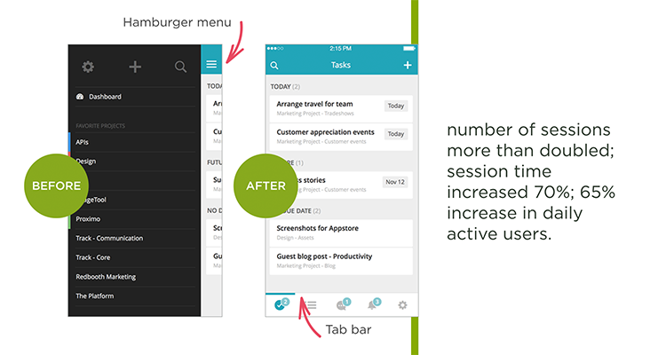
#As stated in one of my latest reports on website design and responsive design, there are alternatives to the hamburger menu! Many websites and applications, including the official Facebook application, are opting in for a tab bar approach. This is a superior option for several reasons - 1. The navigation is not hidden from users 2. More descriptive icons/labels available 3. Quicker navigation to certain pages 4. Can add the hamburger as additional option 5. Tab bar is usually accessible from the bottom of a mobile Having the tab bar accessible from the bottom of the mobile application/website improves the user experience. Luke Wroblewski goes more in depth on the subject of UX and mobile devices which you can find here https://goo.gl/TqCQb2. With the combination of easy to view navigation and easy to access navigation, the tab bar is a strong contender with the hamburger menu. I will also be doing a tutorial on how to add your own tab bar to a web page in the next week over at my YouTube channel.
My Conclusion
#There is no argument, the Hamburger menu is here to stay. At least for the formidable future. That isn't necessarily a bad thing or a good thing. As I stated earlier, the growing use of the hamburger menu allows for a growth in its usability and credibility. This means that with continual growth, the hamburger menu could be the better alternative for mobile navigation. However, as it stands the hamburger menu doesn't work as optimal in comparison to alternatives. There have been several A/B testings done and the hamburger menu has lost the majority. I stand with the alternatives personally but ultimately the products information architecture should have a strong influence on the design choice made.