Dark Mode and Accessibility
Hey! Just so you know, this article is over 2 years old. Some of the information in it might be outdated, so take it with a grain of salt. I'm not saying it's not worth a read, but don't take everything in it as gospel. If you're curious about something, it never hurts to double-check with a more up-to-date source!
Let's talk about the awesomeness of dark mode UI themes and how they can benefit people with disabilities.
Dark mode interfaces are all the rage these days, not just because they look sleek and modern, but also because they have a lot of practical benefits. One of the biggest advantages of dark mode is that it can make websites and applications more accessible for people with visual impairments.
For those with low vision or color blindness, staring at a bright white background can be quite the challenge. The glare from the screen can make it tough to differentiate between letters and words, which can lead to eye strain and fatigue. Dark mode UI themes, on the other hand, provide high contrast between the text and the background, making it much easier to read content on the screen.
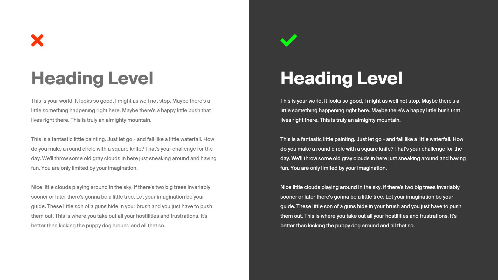
Dark mode vs light mode
#I wanted to show you a couple of designs I created to demonstrate how design can be made more inclusive and accessible to people with visual impairments and related conditions.
On the left, you will see a design with black text on a white background, which is generally legible to most users. However, this design can pose a challenge for some individuals with visual impairments.
On the other hand, the design on the right features white text on a black background, which is legible to the majority of users and a significant improvement for people with visual impairments when compared to the original black-on-white design. This design is a great example of how simple modifications can make a big difference in the accessibility of a website or application.

Dark mode can also be beneficial for people with dyslexia. This neurological disorder affects a person's ability to read and process written language. Many people with dyslexia find it easier to read text on a dark background with light text, as it reduces visual noise and distraction from the background.
But it's not just people with visual impairments and dyslexia who benefit from dark mode. Those who suffer from migraines or other light-sensitive conditions can also find relief with dark mode UI themes. The bright white backgrounds on many websites and applications can be a trigger for migraines and other light-sensitive conditions. Dark mode reduces the brightness of the screen, making it more comfortable for users to read content and navigate the platform.
In addition to its accessibility benefits, dark mode can also enhance the overall user experience. It can make websites and applications feel more modern and sophisticated, which can be appealing to users. Many people also find that dark mode is easier on the eyes, especially when using a device in low-light conditions.
Adding dark mode UI themes to your website or application is a simple yet effective way to make your platform more accessible and user-friendly for everyone. It's a small change that can have a big impact on the usability and user experience of your platform. Plus, it's a great way to show your users that you care about their needs and want to provide them with the best possible experience.
So, whether you're a designer, developer, or user, let's all take a moment to appreciate the wonderful benefits of dark mode UI themes. It's a win-win situation for everyone involved!