Aperture Photography | Mobile Application
Hey! Just so you know, this article is over 2 years old. Some of the information in it might be outdated, so take it with a grain of salt. I'm not saying it's not worth a read, but don't take everything in it as gospel. If you're curious about something, it never hurts to double-check with a more up-to-date source!
Introduction
#Inspired by the previous UI (user interface) that I have created as part of my university course, I designed Aperture Photography.
The Challenge
#The challenge was to create a bespoke mobile application for taking photographs on a smartphone device. I would need to address any frustrations I commonly encounter when using a mobile photography application, and what could be changed to solve the issues.
The Solution
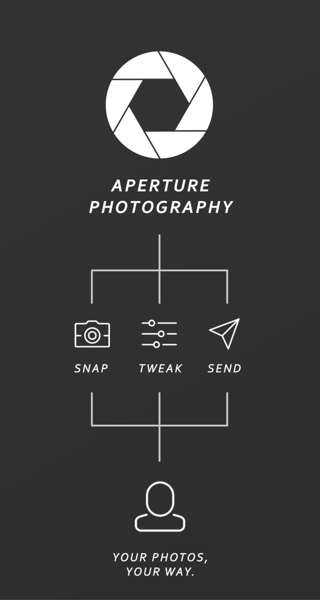
#As part of the solution, I made a priority list of what functions you'd expect in a modern photography application. The list is as follows -
- Taking a photograph
- Reviewing a photograph
- Exploring existing photographs
- Modifying capture settings
- Sharing photographs
Now that I had a list of what a user may expect, I could begin planning a user's journey.
Two Step Design
#When creating the mobile application, I wanted to ensure that a user would always be two steps away from the desired action. Some features that fell as a high priority were always available in shooting mode.
Screens
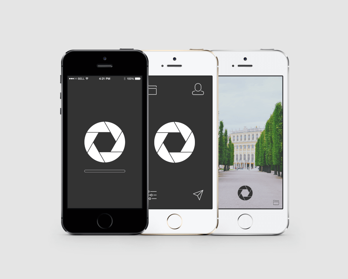
#The design is made up of 2 screens, what I like to refer to as 'Shooting mode' and 'Control mode'.
Shooting Mode
#The shooting mode is a view of what the camera is currently able to see. The features available in the screen are that of taking a photograph, taking a photo and immediately reviewing it (if capture settings have specified), exploring previously shot photos and accessing the neighbouring control mode.
Control Mode
#Control mode allows the user to explore previously shot photographs, modify capture settings, share pictures with a mobile application or through SMS. As with the shooting mode, you can switch between screens.
Reflection
#I feel as if the buttons could have clear text labels to indicate what the button will do. Icons are a fantastic way of speaking an international language in visual communication, but due to there being no written language, interpretations of functions may vary from user to user. I would also redesign the option to view previously taken photographs to include a small thumbnail preview of the latest image. Small thumbnails would act as an inexpensive function that can give immediate feedback to the user on what to expect when reviewing photographs.
Designs
# Full project can be found at my Behance page - https://goo.gl/s68eG4