Animation For The Web
Hey! Just so you know, this article is over 2 years old. Some of the information in it might be outdated, so take it with a grain of salt. I'm not saying it's not worth a read, but don't take everything in it as gospel. If you're curious about something, it never hurts to double-check with a more up-to-date source!
Introduction
#Animation, when used correctly, can positively influence the way in which users interact with the world wide web and the interfaces presented to them.
As part of a University study, several animated components and interfaces have been designed, developed and the use of which examined to gain an insight into what can be achieved using the latest specifications for CSS, SVG, HTML, and native JavaScript (No libraries).
You may view each of the component examples online at https://animationfortheweb.com/. All examples include a compressed snippet of the HTML used for each component.

Implementation
#The reason behind the creation of both interfaces and components is to illustrate how animation can influence a complete interaction (interface designs) and how single components can be animated to reflect the state of a component.
Implementation?—?Interfaces
#Three interfaces have been developed, these include -
1. Modal Interface (Course Progression)
2. Pagination Interface (Card Designs)
3. Transition Interface (Blog Page)
Each of these interfaces provides a unique take on how animation can be applied to show progress, indicate if there are interactive elements, and create transitions in page content.
These interfaces aim to show how fundamental animation principles, such as easing and timing can be applied in front-end website development.
Modal Interface
#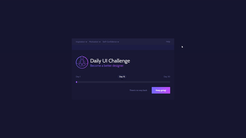
The modal interface is a great example of how multiple animated components interact together as one interface. Most notably the loader animation showing a journey of progression is triggered at page load with the CSS 'animation’ property and keyframes. The reason this animation stands out is that no other interface included in the 'animation for the web’ project includes animation without user interaction.
As well as the animated loader component there are subtle link colour changes upon active states such as ':hover’ ':focus’ and ':active’ which are CSS pseudo-selectors.
Pagination Interface
#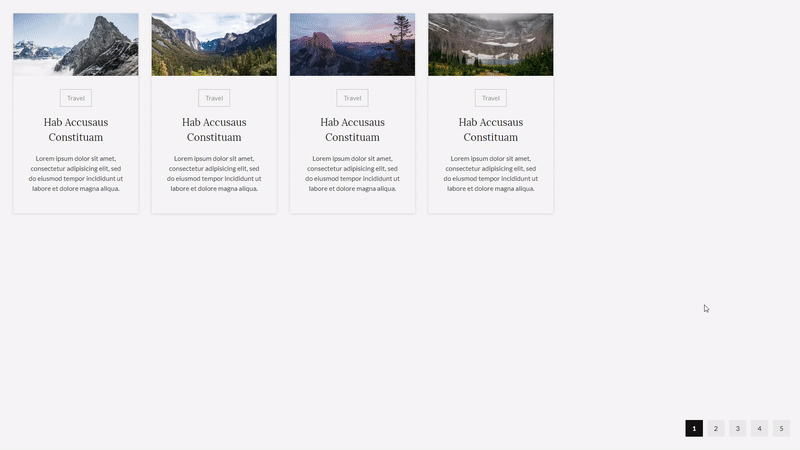
The pagination interface is a great showcase of how elements that are introduced to the page can be animated to create a smooth transition between content. Each card is moved across the page with a 100ms delay between one another.
The choice to introduce new content in a single direction with a quick stagger is inspired by the material.io guidelines by Google on motion and choreography -
“When multiple new surfaces are created at the same time, quickly stagger the appearance of each. Create a clear, smooth focal path in a single direction.”
https://material.io/guidelines/motion/choreography.html#choreography-creation
As well as the strong focus on the animation of introduction to new content and choreography, the interface also includes animated states for the pagination links, and image zooms upon active states of the travel cards.
Transition Interface
#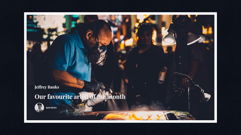
Finally, the transition interface includes a 'content shell’ where the area surrounding the interface does not change, instead the content included in the centre of the shell is swapped out with interaction from the user.
The user is met with a short overview of the content with the title of the content, the author and a featured image as the background image for the initial content state. When a user hovers over the content shell, the image zooms out. This change in background size and the change in cursor state from a point to a click state implies to the user that the action of clicking is available.
Once clicked, the body content is introduced along the x-axis over a 1s transition. This body content includes the body text of the article and artwork from the artist, with the option to return to the introduction state of the content.
This interface displays how smooth transitions can occur between content states without disrupting the content shell.
The transition is achieved with the use of the 'transform’ property and 'translateX’ value. The use of the 'transform’ property in this animation over the use of the 'left’ position property is due to the fact that using the 'transform’ property will result in a smoother end result for the animation.
The smooth results is due to less “Pixel snapping”, you can read more about the choice of translate over position at Paul Irish’s blog, where he covers the topic in great detail?—?https://www.paulirish.com/2012/why-moving-elements-with-translate-is-better-than-posabs-topleft/
Implementation - Components
#As aforementioned at the start of this post, individual components have been designed and developed to show how components can illustrate a change in state, and convey a change when used outside of complete interface designs.
Web animators often refer to interactions with these interactive components as “micro-interactions”, as they play a small part in interface design, but the result is a “macro result”.
All component animation states are programmed to execute in under 0.4s/400ms to ensure the user experience is not affected by slow performant interfaces and are best viewed on a desktop display.
Once programmed, the components are tested in Google Chrome using the Developer Tools Animation tab, more details on this process can be found in the chapter covering Documentation of Production.
Button Component
#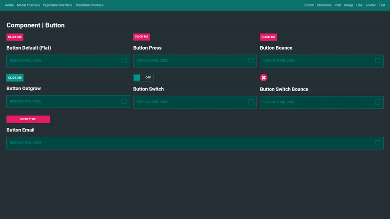
One of the more common animated components, the button can be implemented in various ways. In the examples, there are a variety of buttons, including a 3D button, buttons that bounce, toggle buttons and buttons to have several states to them.
The reason buttons are often animated is because animated states are often used to show interactive elements or to give visual feedback to the user that an action or state of change is occurring. This feedback could come in the form of a change in colour of a button from red to green informing the user that a button is now available to press or that verification has been completed.
Checkbox Component
#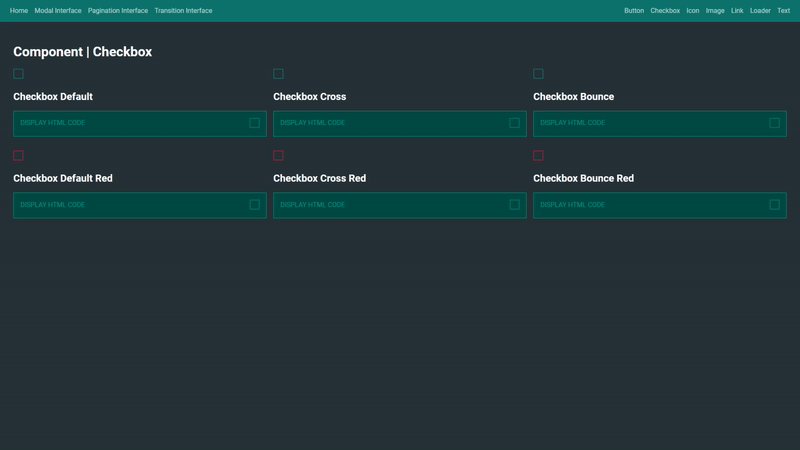
Checkboxes are one of the harder components to style as styling the input directly through CSS can be restrictive. One common workaround that has been implemented in this case is to hide the checkbox input itself and style a label that is linked to the input.
CSS can be used to check the state of the checkbox and update the label style accordingly with the styles for checked and not checked.
Checkboxes by default have no animated state, in raw HTML checking a checkbox happens instantly, and there is no easing. Among the options showcased in the animationfortheweb.com portfolio, easing has been added to checkboxes by default.
The component portfolio also shows variants on how different checkbox icons may be applied, and bouncing transitions between states.
Icon Component
#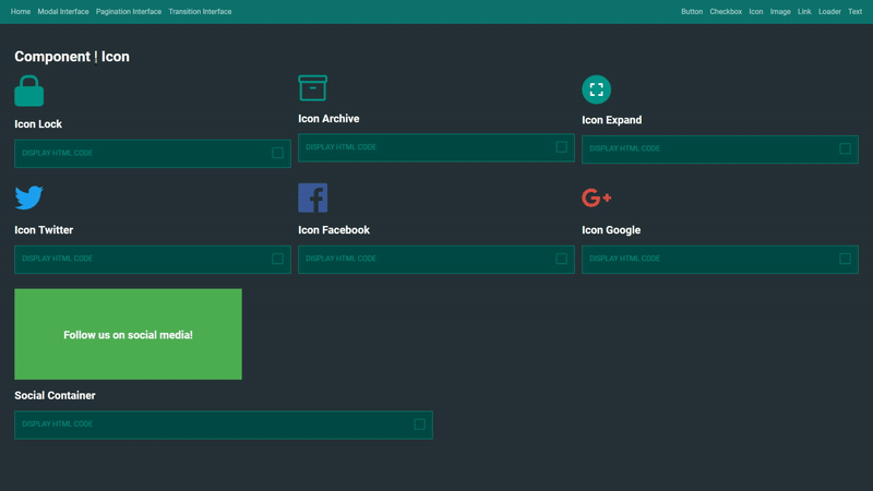
Many could write a whole article on how icons are the universal key of communication when it comes to user interface design, icons are not only a common component to interfaces for the visual stimulation, but they also help describe what actions are available to the user.
In the examples, it is shown how standard icons can be animated to show new states or to express actions and what could happen as a result of interacting with the icon.
One excellent example of this is the icon expand example. The icon in its default state show an icon implying that when clicked upon it will expand. Clicking the icon, as guessed expands the container, as this transition takes place a swap in the icon is made to now reflect the new action available, compressing.
Image Component
#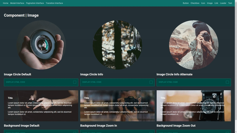
Images are not a common component to animate, however, when working with a large number of images in say an image gallery, information related to the images can be hidden and animated to be shown on interactive states.
In the examples, information of an image caption appearing upon hovering over a circular image is used. The hiding of the caption saves screen space for more images to be shown at once and feels natural when the information is displayed upon hover.
Link Component
#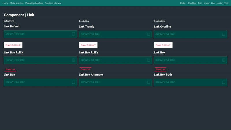
Links or anchor elements as they are referred to in HTML are essential components for user navigation through websites and allow users to discover and explore information from website pages.
By default, links do not have an active state animation. Clicking a link will quickly swap out the colours and previously visited links will often change colour to purple.
Some websites option for trendy approaches to how links are styled, with underlines appearing only when interacted with through a hover or focus state. The portfolio includes these options as examples, although their use does harm user experience as the default state does not communicate that the component is interactable.
Other examples included blur the line between what a button and a link are, the styles applied to links could be replicated for buttons with ease.
Loader Component
#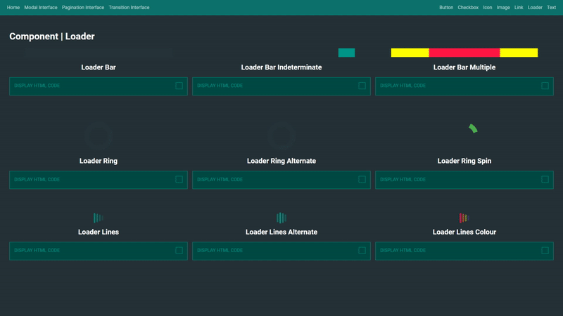
Based on research carried out before the planning and production of animated loading components, it was shown that progress or loading component should be animated somewhere between 2-10 seconds.
All loader examples are animated with a 2-10-second timeline, with the ability to customise the loading time by modifying the CSS property 'animation-duration’.
High Fidelity interactive storyboards
#To ensure animated components were outlined in states, timing and appearance, high fidelity storyboards were included in the production process.
These storyboards help illustrate precisely what CSS properties will be required in the development process of components, such as the transformation in scale, the change in colour and how long the animation should last in total milliseconds.


Documentation of production
#Development
#All of the code used for the production of the 'Animation for the web’ project can be found online via Github as this project is open source and free to use in any project designers or developers want to use it in or for.

Screenshot of .scss file structure in Atom Editor
The project development workflow involved the use of Sass in the form of .scss files that were compiled using node modules.
The Sass structure involved separate style files for each component group and interface page. This allows for focus on the containment of each component as it’s own entity and separate from other styles.
Testing
#Google’s developer tools were used throughout the development process of the animated web components. The developer tools 'Animation’ tab allows for in-depth analysis of animated web elements.
These tools are not only available to those working on analysing their animations but can be used to study and examine any website which includes animation.
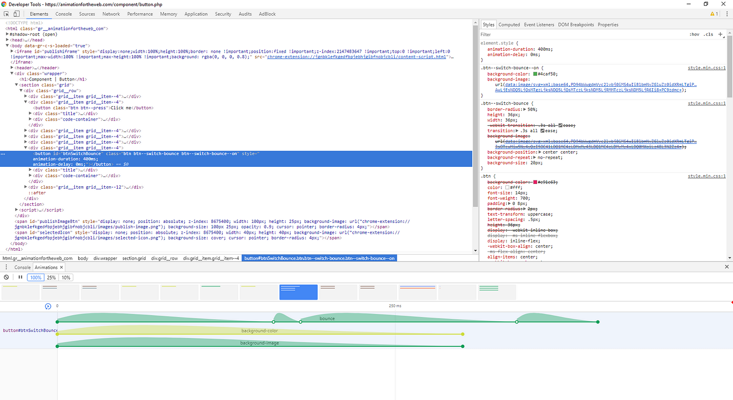
Google Chrome?—?Developer Tools (Animations Tab)
Conclusions
#“At minimum ten components groups shall be selected, e.g. loaders, modals, menus. At least one animated component will be created for each group, with a total of 30 components overall created.”?—?Jack Davies 2017
Six component type groups have been created, with a total of 44 components created. The result does not meet the criteria of 10 component groups but exceeds the total count of 30 components.
The result of the project has lost the initial focus of component only design and a pattern library system that shows how components can exist and animate based on the users interaction.
However, I feel as if this loss of focus has alleviated a narrow mindset into the exploration of how animation works as a whole and not as a contained entity. The introduction of animated interfaces to illustrate web animation serves as a source of inspiration as to how separate entities work together to build a complete experience for users of the world wide web.
Sources of Inspiration and Information
#https://developers.google.com/web/tools/chrome-devtools/inspect-styles/animations
https://material.io/guidelines/motion/choreography.html#choreography-creation
https://www.paulirish.com/2012/why-moving-elements-with-translate-is-better-than-posabs-topleft/
https://www.nngroup.com/articles/clickable-elements/
https://www.smashingmagazine.com/2016/12/best-practices-for-animated-progress-indicators/
https://uxplanet.org/ui-animation-microinteraction-for-macroresult-668cd9e71101Animation