Rebuild Part 8: Cross Compatible (Browser Support)
Hey! Just so you know, this article is over 2 years old. Some of the information in it might be outdated, so take it with a grain of salt. I'm not saying it's not worth a read, but don't take everything in it as gospel. If you're curious about something, it never hurts to double-check with a more up-to-date source!
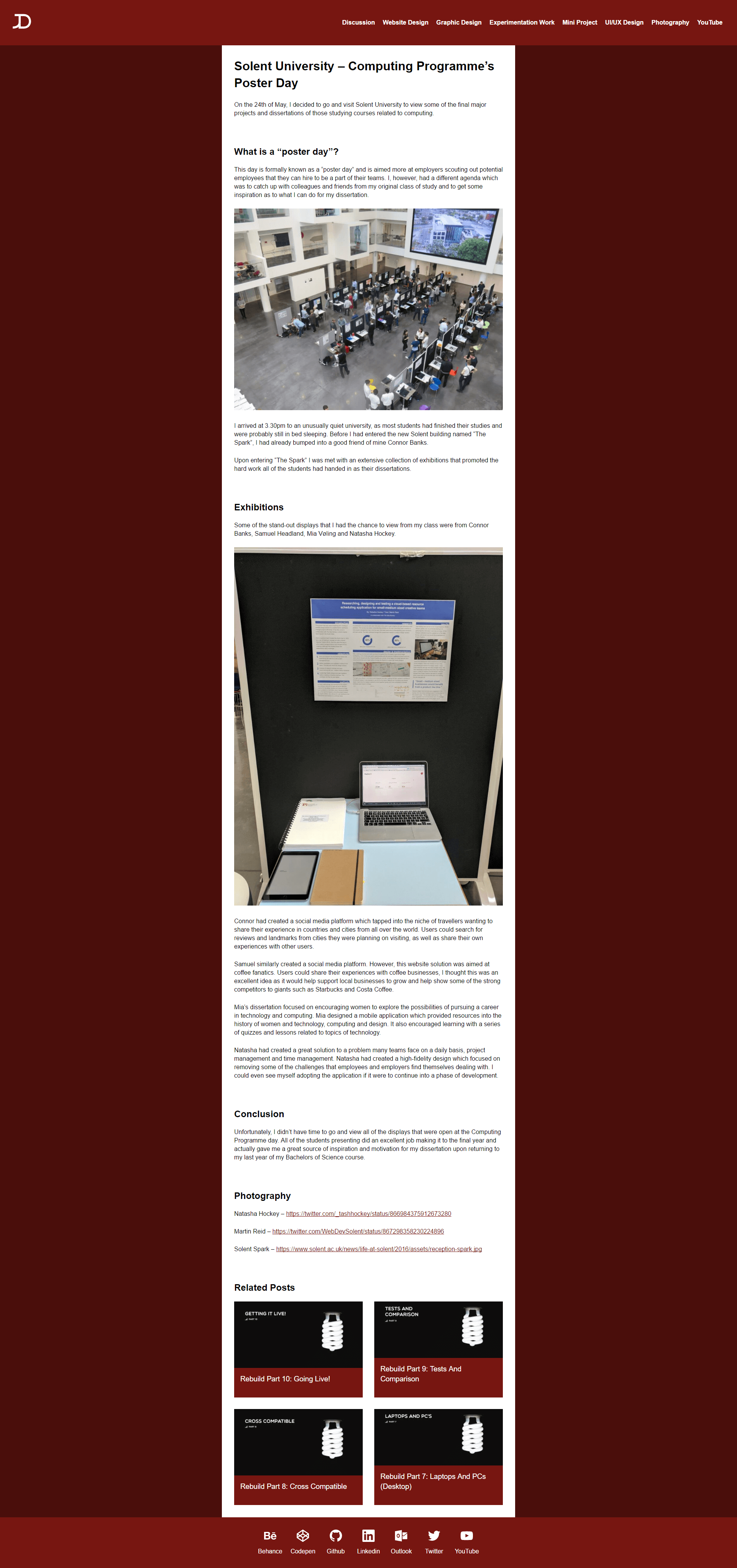
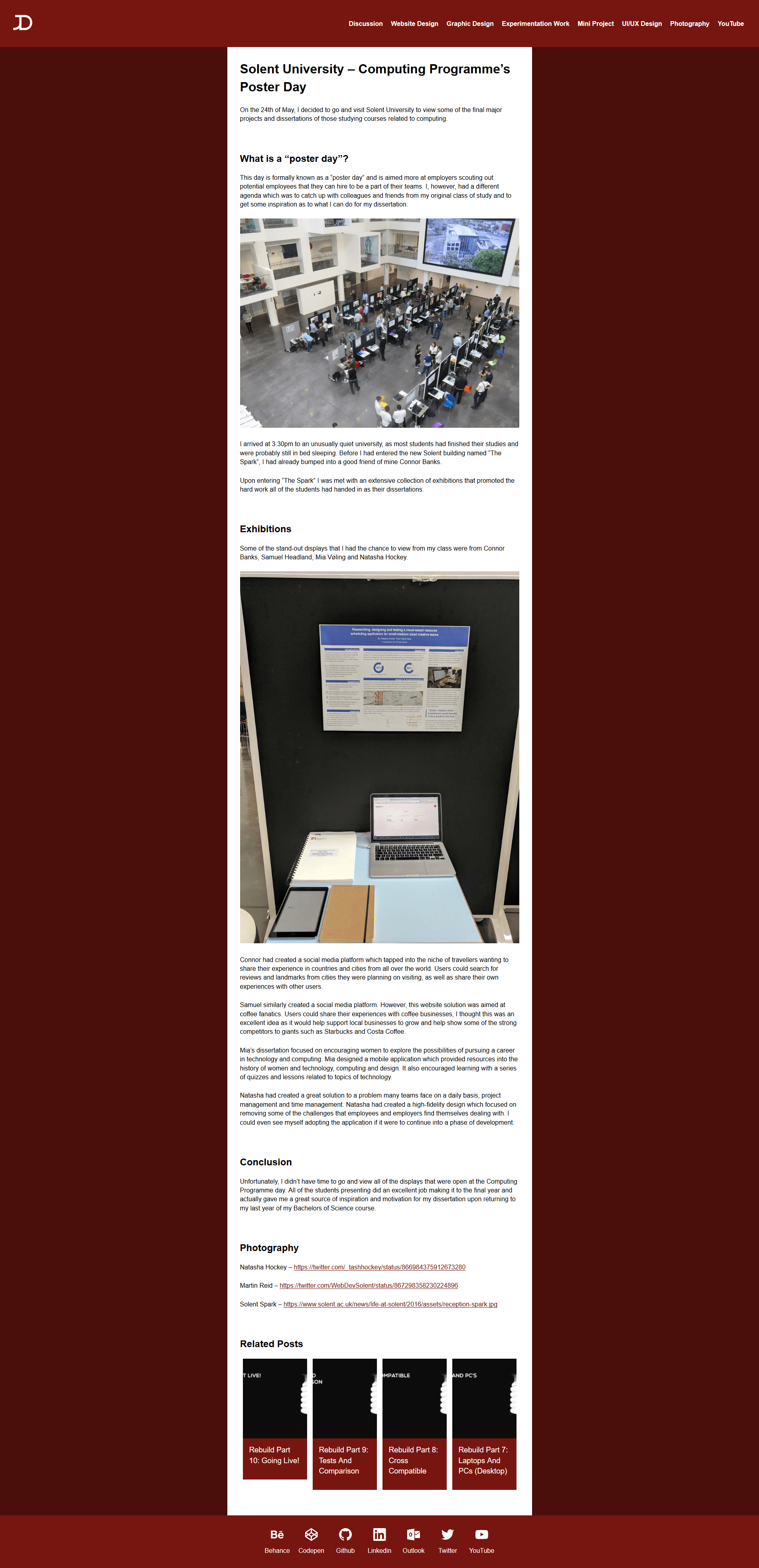
Now that the foundation of the site has is complete, it is time to test the website outside of the Google Chrome browser and see how well the CSS fairs across the primarily used browsers. For this study, I am going to be using the Homepage and a single post page titled 'Solent University - Computing Programme's Poster Day'. The monitor used for testing was a 1920px by 1080px screen. I began testing the pages on the following browsers (version number included) -
- Google Chrome (Version 58)
- Mozilla Firefox (Version 48)
- Microsoft Edge (Version 14)
- Internet Explorer (Version 11)
So with the versions of the browsers noted, let's start testing!
Homepage
#Google Chrome
#All of the previous screenshots for the website rebuild have been made using the Google Chrome browser as it is my primary browser, therefore if you have read previous posts on the rebuild, you will already be familiar with the Google Chrome layout. One reason being the popularity it has achieved and therefore becomes the central focus for the cross compatibility testing when developing a website. As you can see in the figure below, the CSS Grid Layout has generated a 5 column and 3-row display on a 1920 x 1080 browser.
Mozilla Firefox
#The version of Firefox I have installed on my machine does not support CSS Grid Layouts. Fortunately, I have included a support query in my CSS code only to apply a CSS Grid Layout if supported. If the layout method is not supported, it will revert the original layout using floats.
Microsoft Edge
#Similar layouts apply to both of Microsofts browsers, Microsoft Edge and Internet Explorer.
Internet Explorer
#There is one major issue with Internet Explorer and the footer of my website not displaying icons. The bug is most likely due to the way I am loading the images (SVG Sprite Sheet), fortunately, I have still included labels which provide links to my social media accounts.
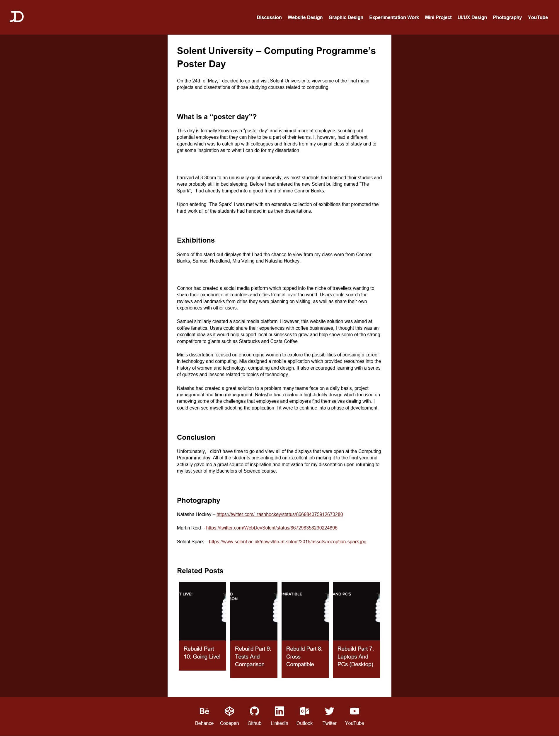
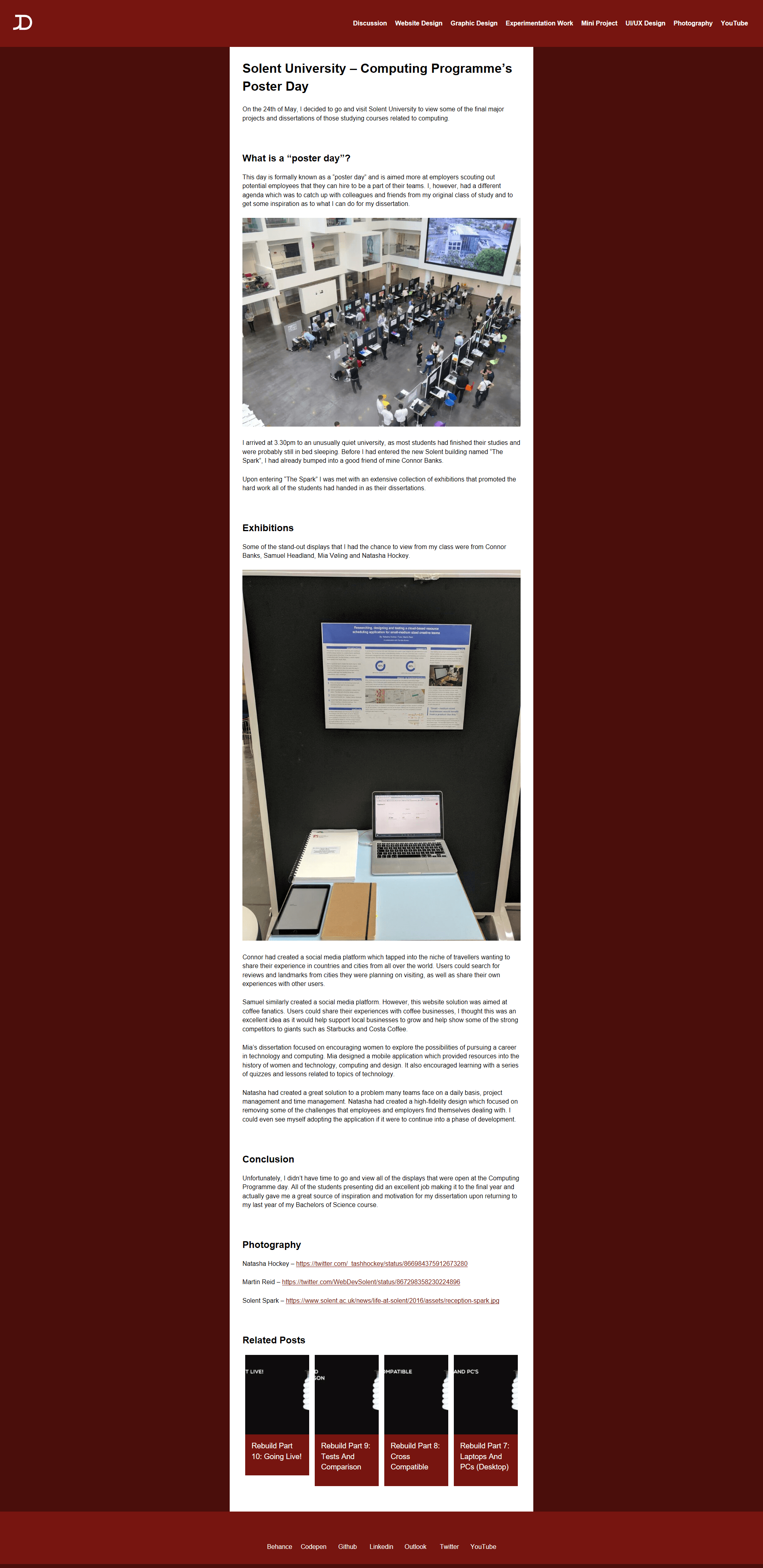
Single Post Page
#Google Chrome
#As stated on the homepage test, Google Chrome screenshots may be familiar from previous posts. The post follows the pattern of a header, wrapper, two by two related items grid and then a footer.
Mozilla Firefox
#Once again as my Mozilla Firefox browser is outdated, the CSS Grid Layout property does not apply. Therefore the related posts revert to a single row as opposed to a two by two grid. Apart from the related posts, the rest of the page displays similar to Google Chrome.
Microsoft Edge
#For some bizarre reason, Microsoft Edge does not display any of the images included in the post. Instead, there are blank areas where the images should load. The bug is an issue that I have only found with Microsoft Edge browser and will require further investigating. Similar to Firefox the CSS Grid Layout fallbacks to a 1-row display.
Internet Explorer
#Similar to the homepage for Internet Explorer, the footer does not display the SVG icons in the footer. Similar to Firefox the CSS Grid Layout fallbacks to a 1-row display.
Conclusion
#As the website was built using progressive enhancement techniques, the website was able to bring in the experimental CSS Grid Layout display feature if supported. Building a website with support for older browsers and then adding features which are only backed by the latest browsers after the original layout works will ensure that all browsers are compatible with the website.